Quick answer: The best empty cart design in Shopify shows three things: a friendly headline, one “Start Shopping” button linked to your best collection, and 2 to 4 best sellers with quick add buttons. You can change the text for free in your Shopify admin, but showing products inside an empty cart drawer needs a cart drawer app like Oxify Cart Drawer & Upsells or custom code. Most themes, including Dawn, cannot do it natively.
This guide covers what to show, message examples you can copy, where the empty cart text lives in your theme code, and a five-minute no-code setup that adds shoppable products to your empty drawer.
Why “Your Cart Is Empty” Costs You Sales
Shoppers open the cart drawer more often than you think. And not always to check what is inside.
They click the cart icon to:
- Check the shipping cost before they commit
- See if a discount code worked
- Find an item they removed by mistake
- Take a pause while comparing products
In every one of those moments, the shopper is still on your store. Still interested. Still one tap from buying.
The default empty cart wastes that moment. It tells the shopper what they already know (the cart is empty) and gives them nothing to do next. On mobile, where the drawer covers most of the screen, it is a full-screen dead end.
Think of it like a physical store. A customer walks up with an empty basket and asks for help. The clerk says “your basket is empty” and walks away. No store would do that. Yet most Shopify themes do exactly this by default.
What to Show Instead: 7 Ideas That Work
You do not need all seven. Pick two or three. A cluttered drawer converts worse than a blank one.
1. A Warm Headline and One Clear Button
Replace “Your cart is empty” with something that points forward, not backward.
- “Your cart is waiting for something great”
- “Nothing here yet. Let’s fix that”
- “Start with our best sellers”
Then add one button. Not three. One. Link it to your best sellers or main collection, not the homepage. The homepage makes shoppers start over. A collection page puts products in front of them right away.
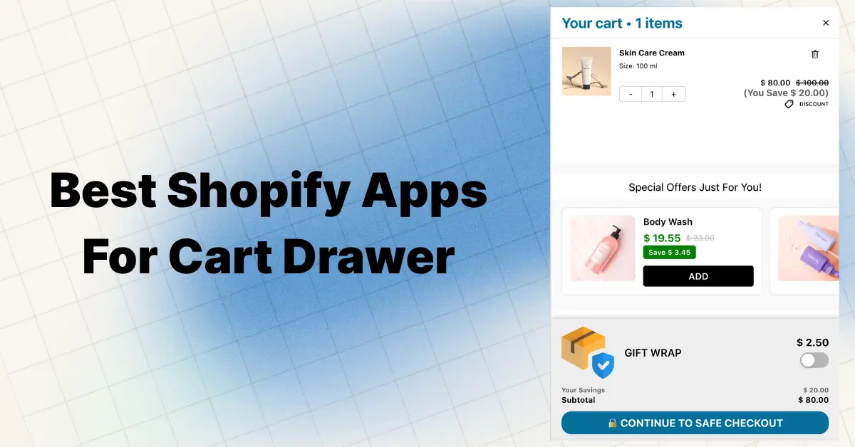
2. Best Sellers with Quick Add Buttons
This is the highest-impact change you can make. Show 2 to 4 of your top products inside the empty drawer with an instant add button under each one.
Why it works:
- Best sellers already have proven demand
- The shopper never leaves the drawer to start buying
- One tap fills the cart and the drawer switches to selling mode
Keep the cards small. Image, name, price, add button. That is enough.
3. Free Shipping Bar at Zero
Show your free shipping progress bar even when the cart is empty. A bar sitting at “$0 of $50 for free shipping” plants a spending target before the first item goes in.
Shoppers who know the threshold upfront build their cart around it. Shoppers who find out at checkout abandon their cart.
4. Collection Shortcuts
For stores with big catalogs, add 3 or 4 tappable category links: New Arrivals, Best Sellers, Sale. These work like a mini menu inside the drawer, so shoppers jump straight to the right shelf instead of hunting through navigation.
Stores like Adored Vintage use this pattern well. Their empty cart points shoppers straight to new arrivals instead of leaving them stuck.
5. Recently Viewed Products
If a shopper browsed three products and then opened an empty cart, show those exact products under a “Pick up where you left off” heading. It is the fastest path back to purchase intent because the shopper already showed interest.
6. A Current Offer
One line about an active deal gives hesitant shoppers a push:
- “Get 10% off your first order with code FIRST10”
- “Buy 2, get 1 free this week”
One offer only. Stacked banners feel desperate and bury the message.
7. A Trust Signal
A single line of social proof calms first-time visitors who opened the cart to scope out your store:
- “Rated 4.9 by 12,000+ shoppers” (use your real numbers)
- “30-day easy returns”
- “Free shipping over $50”
If you want to go deeper on this, see our guide to trust badges in the cart drawer.
Empty Cart Message Examples You Can Copy

The formula that works: a short headline with personality, a plain sub-line that explains the next step, and one button. Personality grabs attention. Clarity does the selling.
Friendly:
- “Your cart is feeling a little light”
- “Nothing in here yet. Your future favorites are one tap away”
Direct:
- “Your cart is empty. Start with our best sellers”
- “Add your first item to unlock free shipping at $50”
Playful:
- “It’s quiet in here. Too quiet”
- “An empty cart is just a full cart waiting to happen”
Urgency:
- “Your cart is empty, but FIRST10 gets you 10% off today”
One warning on playful copy. A joke with no next step is still a dead end. Keep the wit in the headline and keep the sub-line and button dead simple.
Can Your Theme Show Products in an Empty Cart?
This is the question most merchants hit after changing the text. Short answer: probably not.
- Dawn and most free Shopify themes have no empty cart recommendations. The drawer shows the message, a button, and nothing else.
- Shopify Search & Discovery related products are based on what is already in the cart. Empty cart means nothing to base them on, so nothing shows.
- A few paid themes (Canopy is one example) let you pin “promoted products” that can appear when the cart is empty. Check your theme documentation.
For everyone else, showing products in an empty drawer takes either custom JavaScript work or a cart drawer app like Oxify Cart Drawer & Upsells, which adds them without touching your theme. We cover both routes below.
3 Ways to Change Your Empty Cart Design on Shopify
| Method | Cost | What you can change | Risk |
|---|---|---|---|
| Edit default theme content | Free | Text only | None, but does not work on every theme |
| Edit theme code | Free | Text, fonts, colors, layout | Theme updates can wipe your edits |
| Cart drawer app | Free plan available | Text, button, products, shipping bar, everything | None, no theme files touched |
Option 1: Change the Text Without Code
Shopify lets you change default theme wording from the admin:
- Go to Online Store, then Themes
- Click the three dots next to your theme, then Edit default theme content
- Search for “empty”
- Replace “Your cart is empty” with your new message
- Save
Shopify documents this in its theme content editing guide.
One catch reported often in the Shopify Community: on some themes this changes the cart page text but the drawer keeps showing the old message. That happens when the theme hard-codes the drawer string instead of pulling it from theme content. If your drawer does not update, you need Option 2 or 3.
And remember, this route only changes words. No products, no shipping bar, no custom button link.
Option 2: Edit the Theme Code (Dawn Example)
In Dawn and most Online Store 2.0 themes, the empty cart pieces live here:
- The text sits in
locales/en.default.json. Search the file for “empty” under the cart section and edit the value. - The drawer markup is in
snippets/cart-drawer.liquid, which pulls the text through thesections.cart.emptytranslation key. - The cart page version lives in
sections/main-cart-items.liquidusing the same key.
To style it, add CSS to base.css. For example, to resize the drawer message:
.cart-drawer__warnings .cart__empty-text {
  font-size: 18px;
  font-weight: 600;
}
The trade-offs:
- Theme updates can wipe your edits
- One typo in a liquid file can break the cart
- Adding product recommendations to an empty drawer requires real JavaScript work, since Shopify’s recommendations endpoint needs a product to work from
If you go this route, duplicate your theme first. Our cart drawer custom CSS guide has copy-paste snippets for common fixes.
Option 3: Use a Cart Drawer App
A cart drawer app replaces the theme’s empty state with a fully designed one. No code. No theme edits. Changes go live instantly and survive theme updates.
This is the only route that gives you product recommendations, quick add buttons, a shipping bar, and styled text in one place. Oxify Cart Drawer & Upsells does all of this from a visual editor, so you design the whole empty cart without writing a single line of code. If you are comparing options first, here is our honest roundup of the best Shopify cart drawer apps.
How to Set It Up in Oxify Cart Drawer & Upsells
We build Oxify Cart Drawer & Upsells, so this walkthrough matches the exact settings you will see in the app. The whole setup takes about five minutes.
Step 1: Open Cart Empty Settings
Inside the cart editor, find the Cart Empty Settings panel. You get full control over every element:
- Empty Cart Title. Replace “Your cart is empty” with your own headline. Set the text color, font size, and weight. A bold 16px headline in your brand color works well.
- Empty Cart Description. Add a softer second line like “Looks like you haven’t added anything yet.” Keep it lighter and smaller than the title, around 14px regular, so the headline stays dominant.
- Translations. Every text field has an Add Translations link, so multi-language stores show the right message in every market.

Step 2: Add the Button
Check “Show Empty Cart Button” and configure it:
- Button Text. “Start Shopping” is the safe default. “Shop Best Sellers” is more specific and usually better.
- Button Click Action. Choose Open Link to send shoppers to a page, or Close Cart Drawer to drop them back where they were browsing.
- Button Link. Point it at
/collections/best-sellersor your top collection. Avoid the homepage. - Styling. Set the button text color, size, background color, and border radius to match your theme. A solid dark button with white text and an 8px radius fits most stores.
Step 3: Turn On Empty Cart Recommendations
This is the part theme edits cannot do. Toggle Empty Cart Recommendations on and the drawer shows shoppable products the moment it opens:
- Choose Manual Recommendations. Hand-pick the exact products that appear. Choose your proven best sellers, not random items.
- Recommendations Title. Defaults to “You may also like.” For an empty cart, something like “Popular right now” fits better. The title field supports bold, italics, links, and color.
- Button Text. Set the quick add button label (ADD), the label for products with variants (CHOOSE), and the confirm button inside the variant picker (ADD TO CART). Shoppers with simple products add in one tap. Shoppers picking a size or color get a clean bottom sheet instead of a page redirect.
Save, open your store in an incognito tab, and click the cart icon with nothing in it. You should see your headline, your button, and a row of products ready to add. And once the first item lands in the cart, in-cart recommendations take over to keep building the order.
For the rest of the drawer (colors, upsells, shipping bar), see the full cart drawer customization guide.
Best Practices for Empty Cart Design
- One primary action. A button plus recommendations is plenty. Five competing blocks freeze shoppers.
- Design for mobile first. Most cart opens happen on phones. Use large tap targets and compact product cards. Test on your own phone, not just desktop preview.
- Keep it fast. A drawer that lags while loading recommendations is worse than an empty one. Use a lightweight, Built for Shopify app so the drawer opens instantly.
- Stay positive. “Discover our best sellers” beats “Your cart is empty.” Point at what comes next, not what is missing.
- Keep it usable for everyone. Readable text contrast, buttons big enough to tap, and a drawer that can be closed easily. An empty state that traps or confuses shoppers loses them for good.
- Test it. Run best sellers against collection links for two weeks each. Keep whatever lifts add-to-cart rate. Your data beats anyone’s advice.
Common Mistakes to Avoid
- Linking the button to the homepage instead of a collection
- Showing 8+ recommended products in a narrow drawer
- Stacking multiple promo banners in one empty state
- Using a clever joke with no clear next step
- Using tiny tap targets that frustrate mobile shoppers
- Forgetting to test the empty state after setup (most merchants only ever test the full cart)
How to Know If It Is Working
Watch these numbers for two to four weeks after the change:
- Clicks on empty cart recommendations
- Add-to-cart rate from the drawer
- Bounce rate on sessions that opened an empty cart
- Conversion rate and average order value
Even a small lift matters here because the empty cart gets opened constantly. Small percentage, big volume.
FAQ
Can I change “Your cart is empty” without an app?
Yes. Go to Online Store, Themes, Edit default theme content, search “empty,” and replace the text. On some themes this only updates the cart page, not the drawer. It also cannot add products, custom button links, or a shipping bar. For a full empty cart design without coding, a cart drawer app like Oxify Cart Drawer & Upsells handles all of it.
Where is the empty cart text in the Dawn theme code?
In locales/en.default.json under the cart section. The drawer pulls it through the sections.cart.empty key in snippets/cart-drawer.liquid, and the cart page uses sections/main-cart-items.liquid. Duplicate your theme before editing code.
Can Dawn show product recommendations in an empty cart?
Not natively. Dawn’s empty drawer shows only the message and a button. Shopify’s related products need items in the cart to work from, so an empty cart shows nothing. You need a cart drawer app or custom JavaScript.
What should I show in an empty cart drawer?
A friendly headline, one button linked to a top collection, and 2 to 4 best sellers with quick add buttons. Add a free shipping progress bar at zero if you offer a threshold.
Will adding recommendations slow down my cart drawer?
Not if the app is built well. Pick a Built for Shopify app that loads recommendations without blocking the drawer. A laggy drawer hurts conversions more than an empty one.
Should the empty cart button go to my homepage?
No. Send shoppers to a collection page, ideally best sellers. The homepage forces them to start their journey over.
Stop Wasting the Click
Every shopper who opens an empty cart just handed you their attention. The default theme throws it away. A good empty cart design hands back products, a path, and a reason to keep going.