 Oxify
Shopify Product Page Optimization: 25-Point Checklist (2026)
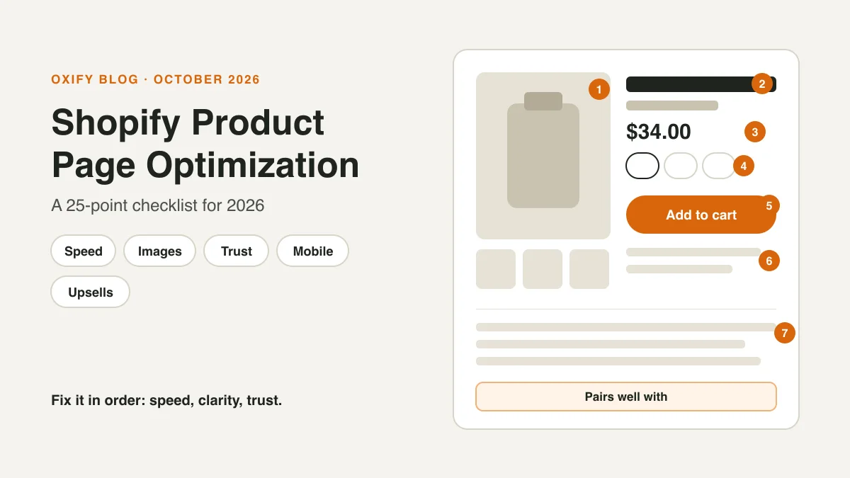
A product page has one job: answer a shopper's questions before they have to ask. What is it? What will I really pay? Can I send it back? Can I trust this store?
Miss an answer, and they leave. Baymard Institute scored 155+ top ecommerce sites and found that 52% of desktop and 62% of mobile product pages are "mediocre or worse."
This checklist has 25 checks. Each one says what to look for, why it matters and how to fix it on Shopify. Start with the five marked ★.
Jump to: phone · what is it? · what will I pay? · trust · Google · upsells · score yourself · FAQ
Quick Answer (For Skim Readers)
- Start here (★): mobile speed, an easy Add to cart button, a sharp main image, the total cost, and returns info.
- Every check has a fix you can make in your Shopify admin or theme editor.
- Use the score card at the end to see where you stand.
- Change one thing at a time, then watch revenue per visitor.
How to Use This Checklist
- Open your best-selling product on your phone, in a private window.
- Go through the checks. Mark each one pass or fail.
- Fix the five ★ items first.
- Come back for the rest, one group at a time.
The map below shows where each check lives. Seven of them sit behind the scenes, so you won't see them on the page itself.
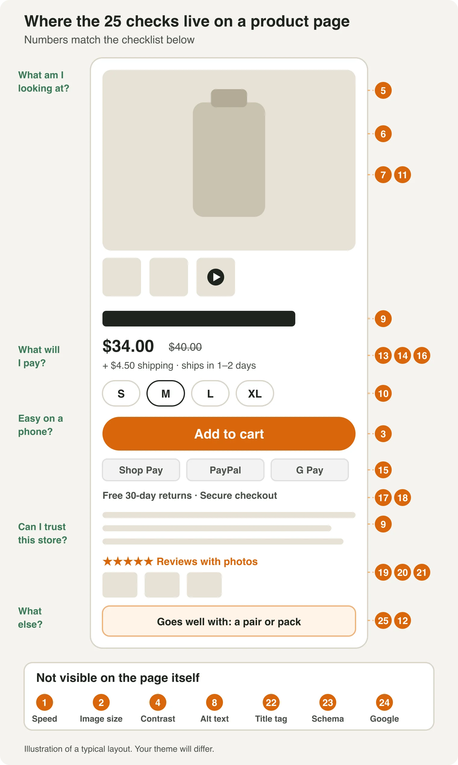
Free tools you'll use:
- Shopify's web performance report and Google's PageSpeed Insights (check 1).
- Google's Rich Results Test (check 23).
- Google Merchant Center, through Shopify's Google & YouTube app (checks 23 and 24).
Is It Fast and Easy on a Phone?
1. ★ Pass Core Web Vitals on mobile
- Check: In your Shopify admin, open Analytics, then Reports, and find the web performance report. It uses real shopper data.
- Why: Google calls a page "good" when three numbers pass for 75% of visits. LCP must be 2.5 seconds or less, INP 200 milliseconds or less, and CLS 0.1 or less.
- In plain words: LCP is how fast the main content shows. INP is how fast the page reacts to a tap. CLS is how much the page jumps around.
- Fix: Remove apps you no longer use. Resize big images. Keep the top of the page light.
2. Upload images at the right size
- Check: Open a product and look at its images. Are any tiny, or huge?
- Why: Shopify suggests 2048 × 2048 pixels for square images. Files can be up to 5000 × 5000 pixels and 20 MB, but you rarely need that. Too small, and zoom looks blurry.
- Fix: Upload around 2048 pixels. Use the same shape for every image, so the page doesn't jump as photos load.
3. ★ Make Add to cart easy to see and tap
- Check: On a phone, can you see the button without scrolling? Can you tap it with a thumb?
- Why: The accessibility standard WCAG 2.2 asks for tap targets of at least 24 × 24 CSS pixels. Bigger is easier.
- Fix: Make the button full width on phones. A big main image can push it below the first screen, so a sticky bar helps. Horizon, one of Shopify's free themes, has a "Sticky add to cart bar" setting. Dawn doesn't, so Dawn stores need an app or custom code. See our list of sticky cart apps.
4. Check text and button contrast
- Check: Look for light gray text on white, or pale buttons.
- Why: WCAG asks for a contrast ratio of at least 4.5 to 1 for normal text, including the words on a button. If a button's edge is what shows it's a button, that edge needs 3 to 1, and so do icons that carry meaning.
- Fix: Darken the color. Test it with any free contrast checker.
What Am I Looking At?
5. ★ Give shoppers a big, sharp main image with zoom
- Check: On your phone, tap the main image. Can you zoom in on small details?
- Why: In Baymard's usability tests, 56% of users' first action was to explore the product images. It also found that 25% of sites had images that were too small or too hard to zoom. That study dates from 2020.
- Fix: Upload a 2048-pixel image. Look for an image zoom option in your theme's product page settings.
6. Show size and fit
- Check: Can a shopper tell how big the product is from the photos? If it comes in sizes, does the page say how it fits?
- Why: Baymard says 42% of users judge size from images. Yet 37% of sites have no "in scale" image, and 23% have no photo with a human model. Shoppers can't try it on, so fit is their first doubt.
- Fix: Add a photo with the product in a hand, on a person, or next to an object everyone knows, like a mug. For sizes, add a size chart as a popup or collapsible tab. Many themes have a block you can fill for this.
7. Give each variant its own photo
- Check: Pick each color or style. Does the image change?
- Why: Shoppers want to see the exact one they're buying.
- Fix: In the product, click the variant and assign its image. Shopify lets each variant use one image. Put extra angles in the gallery.
8. Write alt text for every image
- Check: Open the product's media. Is any alt text empty?
- Why: Google says alt text is the most important metadata for an image. It also helps people who use screen readers.
- Fix: Describe the image in one plain sentence. Shopify allows up to 512 characters and recommends 125 or fewer.
9. Write a clear title and a scannable description
- Check: Read the first two lines. Do they say what it is and who it's for?
- Why: Google's guidance asks for original, useful content, not text copied from elsewhere. Supplier text can show up on other stores too.
- Fix: Lead with the main benefit. Use short bullets for materials, size and care.
- Example (made up): weak: "Cotton T-shirt. Machine washable." Better: "A soft, heavyweight tee for everyday wear. 100% cotton, regular fit, machine washable."
10. Use buttons for sizes and options
- Check: Are sizes hidden in a dropdown?
- Why: Baymard found that 57% of sites don't use buttons for size selection.
- Fix: Switch your variant picker to buttons in the theme editor. A Shopify product can have up to 3 options and 2,048 variants. More than that needs an app or custom code. Shopify also warns that some themes, apps and sales channels may not support more than 100 variants.
11. Add a short video
- Check: Is there a video that shows what photos can't, like movement, fit or how it works?
- Why: Shopify's help center says video on a product page can raise a shopper's confidence. Its product page guide says a video is worth adding when it shows something a photo can't. Neither gives a lift number, so treat it as a test.
- Fix: Film a short clip on your phone. In the product's media, upload the file (Shopify allows up to 10 minutes and 1 GB) or paste a YouTube or Vimeo link. Your theme must support video. All of Shopify's Online Store 2.0 themes do.
12. Plan for sold-out products
- Check: Open a sold-out product. What does the shopper see?
- Why: A dead end loses the shopper. We found no built-in back-in-stock alert in Shopify, so this needs an app.
- Fix: Keep the page live. Add a "notify me" form with an app. Show a similar item.
What Will I Really Pay?
13. ★ Show the total cost early
- Check: Can a shopper estimate shipping and tax before they add to cart?
- Why: Baymard found that 67% of sites show no total-order-cost estimate near the buy button. Among shoppers who left a cart and weren't just browsing, Baymard's survey found 40% left over extra costs, and 12% because they couldn't see the total up front.
- Fix: Put a shipping note by the price, like "Free shipping over $50." If shipping and tax vary a lot, add a calculator.
14. Show a delivery time near the button
- Check: Does the page say when it will arrive?
- Why: In the same Baymard list, 20% of shoppers who left a cart said delivery was too slow.
- Fix: Add a short line such as "Ships in 1 to 2 days." Only promise what you can do.
15. Show payment options
- Check: Do shoppers see express checkout buttons and, if you offer it, installments?
- Why: In the same list, 9% said there weren't enough payment methods.
- Fix: If you use Shop Pay Installments, check that its message shows near the price. Shopify's help page covers the product page banner. It needs Shopify Payments and Shop Pay, and works for stores in the US, Canada and the UK, with Australia in early access.
16. Keep "was" prices and urgency honest
- Check: Do you show a crossed-out price, a countdown or "only 3 left"? Is each one true?
- Why: In the US, the FTC's pricing guides say a "was" price must be one you really offered to the public, not one set high to fake a discount. UK rules from 6 April 2025 ban falsely saying an offer is available for a limited time, including a countdown clock that restarts. The EU asks price-cut notices to show the lowest price from the prior 30 days.
- Fix: Use countdowns only for real end dates. Keep a record of your old prices. This is not legal advice, so ask a lawyer.
Can I Trust This Store?
17. ★ Put returns info on the page
- Check: Is there a line or link about returns near the Add to cart button?
- Why: In Baymard's survey of 1,032 shoppers, 60% look for returns info on the product page. Yet 44% of sites don't show or link it.
- Fix: Add a short line that states your policy, linked to the full page. A text or collapsible block under the buy button works well.
18. Add trust cues near the button
- Check: Next to Add to cart, is there anything that says it's safe to buy here?
- Why: In the Baymard list, 19% of shoppers who left a cart didn't trust the site with their card details.
- Fix: Add your guarantee, a way to reach you (email, chat or phone), and icons for payment methods you really accept. Skip made-up badges.
19. Show reviews with photos
- Check: Are there reviews on the page, with customer photos?
- Why: Baymard says 63% of sites don't let shoppers browse reviewer photos across reviews.
- Fix: Pick a review app that supports photo reviews and a photo gallery. Compare options in our best Shopify review apps.
20. Reply to bad reviews
- Check: Are there 1 to 3 star reviews with no answer?
- Why: Baymard found that 89% of sites don't respond to negative reviews. In its tests, shoppers read the bad ones closely and took a reply as a sign the store cares.
- Fix: Reply calmly and offer help. Make staff replies look different from customer reviews.
21. Keep reviews honest
- Check: Do you show only 5-star reviews, or pay for good ones?
- Why: The FTC's reviews rule took effect on October 21, 2024. It bans fake reviews. It also bans implying that the reviews you show are most or all of them when you hide the low-rated ones. Penalties can reach $53,088 per violation.
- Fix: Show a real mix. Don't pay for positive reviews. Don't threaten people who leave bad ones. This is not legal advice.
Can Google Find It?
This matters beyond Google search. Shopify says half of AI-referred shopping sessions in Q2 2026 landed straight on a product page. Clear titles, facts, prices and reviews help in both places.
22. Write a unique title tag and meta description
- Check: Open the product and scroll to Search engine listing. Is it blank, or just the product name?
- Why: Shopify allows page titles up to 70 characters, but 60 or fewer is the safer target. Meta descriptions can run to about 160.
- Fix: Put the product name and one real detail in the title. Use the words shoppers search for in the title, the product name and the URL handle. Write the meta description as a short pitch.
- Also: link to the product from its collection page and from a related blog post, so Google and shoppers can find it.
23. Check your product schema
- Check: Paste a product URL into Google's Rich Results Test.
- Why: Shopify's structured_data filter outputs product data. Google needs a name, an image and a price with currency for merchant listings. It also recommends return and shipping details.
- Fix: Fix any errors the test shows. Add your return and shipping policy in Google Merchant Center where you can. If your review app adds review data, the test shows that too.
24. Connect Google's free listings
- Check: Is the Google & YouTube app installed, with your products synced?
- Why: Eligible stores can show products free in Google's Shopping tab. It works only in certain countries and currencies.
- Fix: Install the app, connect Merchant Center, and fix any product errors it flags.
- Also: add your store to Google Search Console and see which product pages get seen. When a product is gone for good, set up a URL redirect to the closest product or collection.
What Else Might I Need?
A note from me. I'm Aditya, co-founder of Oxify, which makes upsell apps. I still put this check last on purpose. An offer can't fix a page that is slow, unclear or hard to trust. Get checks 1 to 24 right first.
25. Offer one "goes with" pair or a pack
- Check: Does the page suggest anything else the shopper might need?
- Why: Growth Suite, which makes a rival app, averaged its own stores in 2026: product-page offers had a 7% take rate, below the cart's 12%, but they were shown the most, 50 million times. In our dashboards, one UK store earned £1,200.34 in 30 days from product-page offers alone, and Replenhair's product-page offers brought in £4,136. Both are app-attributed, not tests.
- Fix: For free, add complementary products in Search & Discovery, or sell a bundle with Shopify's free Bundles app. With an app, you can add bundles, bought-together blocks and quantity breaks.
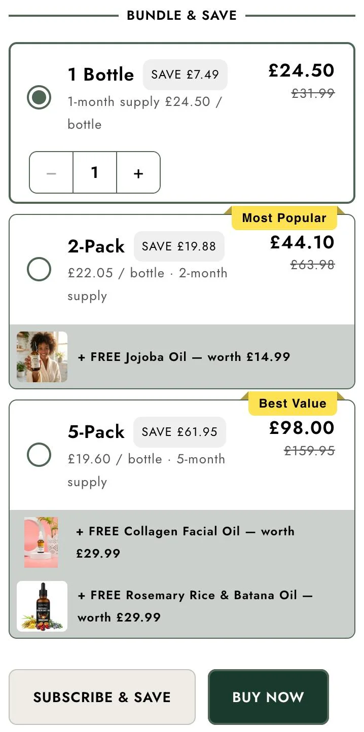
Steps for both routes are in how to upsell on Shopify. For the product page in depth, read how to upsell on Shopify product pages.
Score Yourself
Count your passes out of 25.
| Passed | What it means | Do next |
|---|---|---|
| 21 to 25 | Strong page | Test new offers and photos |
| 15 to 20 | Good base | Fix the ★ items you missed, then trust and returns |
| 8 to 14 | Gaps to close | Do the five ★ items first |
| 0 to 7 | Start here | Do one ★ item a day |
These bands are our rough guide, not a standard.
How to Test Your Changes
- Change one thing at a time. Write down the date.
- Pick one main number and two checks. Watch revenue per visitor first. Then check average order value and your return rate, so a "win" doesn't hide a problem.
- Know where to look. In Shopify, go to Analytics, then Reports. The Behavior reports include Conversion rate breakdown, which shows where sessions drop off, and Product recommendation conversions over time.
- Be patient. A store with a few orders a week needs more time to see a pattern. Pick an end date before you start, and stop then, not when the numbers look good.
- Try Shopify's Rollouts. Under Markets, Rollouts has an Experiment type with a 50/50 split by default. It can test theme, checkout and catalog changes. Your store must be on the Grow plan or higher.
Shoppers adding to cart but not buying? Run our add to cart but no sales checklist next.
The Whole Checklist on One Page
Copy this into a doc or a Trello card. ★ marks the five to fix first.
- ☐ 1. ★ Pass Core Web Vitals on mobile
- ☐ 2. Upload images at the right size
- ☐ 3. ★ Make Add to cart easy to see and tap
- ☐ 4. Check text and button contrast
- ☐ 5. ★ Give shoppers a big, sharp main image with zoom
- ☐ 6. Show size and fit
- ☐ 7. Give each variant its own photo
- ☐ 8. Write alt text for every image
- ☐ 9. Write a clear title and a scannable description
- ☐ 10. Use buttons for sizes and options
- ☐ 11. Add a short video
- ☐ 12. Plan for sold-out products
- ☐ 13. ★ Show the total cost early
- ☐ 14. Show a delivery time near the button
- ☐ 15. Show payment options
- ☐ 16. Keep "was" prices and urgency honest
- ☐ 17. ★ Put returns info on the page
- ☐ 18. Add trust cues near the button
- ☐ 19. Show reviews with photos
- ☐ 20. Reply to bad reviews
- ☐ 21. Keep reviews honest
- ☐ 22. Write a unique title tag and meta description
- ☐ 23. Check your product schema
- ☐ 24. Connect Google's free listings
- ☐ 25. Offer one "goes with" pair or a pack
Related Guides
- Best Shopify Page Builder & Landing Page Apps in 2026: 19 Compared
- 16 Best Shoppable Video Apps for Shopify (October 2026): Pricing, SEO & Real Cost
Frequently Asked Questions
What makes a good Shopify product page?
How many images should a Shopify product page have?
How do I make my Shopify product pages rank on Google?
How do I improve my Shopify product page conversion rate?
About This Guide
- Who: published by Oxify, which makes Shopify upsell apps. Check 25 is where our own product comes in, and we say so.
- How we checked it: the 25 checks draw on Baymard Institute's research, Shopify's help center and developer docs, Google Search Central, W3C accessibility guidance and the FTC and UK regulator pages linked above. We read each one on October 29, 2026. We did not test every step on a live store, and Shopify changes its admin often. If a button has moved, tell us.
- Why we wrote it: most checklists list tips without saying where the number or rule comes from. We link the source for most checks, so you can judge them yourself.
Add a Pair or Pack to Your Product Page
Check 25 is the easiest win once the basics pass. Oxify Cart Drawer & Upsells lets you add bundles and "bought together" offers next to the Add to cart button. It runs in the same app as our cart drawer.
Start a 14-day free trial of Oxify Cart Drawer & Upsells on the Shopify App Store and add your first pair.
My promise: put Oxify Cart Drawer live with at least one offer for 30 days. If your average order value hasn't gone up, email us and we'll refund 100% of what you paid. See pricing.