
Cart Drawer Best-Practices Checklist: 10 Pass/Fail Tests (2026)
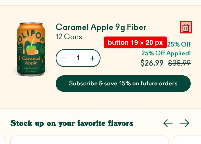
On September 19, 2026, we opened the carts of three big Shopify brands on a phone-sized screen and measured them. All three looked great. But on two of them, the button that removes an item was smaller than the accessibility minimum: 19×20 px on Olipop and 16×16 px on Allbirds, against a 24 px floor. If brands that size miss a basic check, your drawer probably misses one too.
That's what this page fixes. Below is a one-page, 10-point cart drawer best-practices checklist. Every point has a simple pass/fail test. You can copy it straight into a Figma handoff, a Jira ticket, or a sprint planning doc.
Quick answer: A good cart drawer (1) opens fast, (2) keeps the checkout button always visible, (3) shows the full cost with no surprises, (4) lets shoppers edit items easily, (5) shows free-shipping progress, (6) offers one or two relevant upsells, (7) works with a keyboard and screen reader, (8) has big tap targets on mobile, (9) handles errors and empty carts, and (10) is tracked so you know it's working.
What Is a Cart Drawer (and Why Does It Need a Checklist)?
A cart drawer (also called a slide cart or mini cart) is the panel that slides in when a shopper adds a product, so they never leave the page. It needs a checklist because it sits at the most expensive moment in your store: the shopper has already said "I want this." Full explainer here.
- 70.22% of online carts get abandoned. That's the average across 50 industry studies.
- The #1 reason? Extra costs like shipping, tax and fees that show up too late. 40% of shoppers who quit give this reason. Another 12% left because they couldn't see the total cost up front.
- Speed matters on mobile. In a large study of 37 brand sites and over 30 million sessions, a 0.1-second faster mobile site lifted retail conversions by 8.4% and order spend by 9.2%.
- Drawers can backfire on phones. In one store's A/B test, a drawer lifted desktop conversions 17% but dropped mobile conversions 8.4%. It's one store, so treat it as a warning, not a rule. A sloppy mobile drawer costs money.
We read the top-ranking cart drawer guides before writing this. Most are galleries of pretty examples. Almost none give numbers, accessibility rules or QA steps, and none score real stores against a checklist. We did that too (see the 4 brands below). Designers and developers need tests, not just ideas. That's the gap this checklist fills.
Key facts (verified September 19, 2026):
- Average cart abandonment: 70.22% (50 studies).
- Top abandonment reason: extra costs, 40%.
- "Good" tap response: 200 ms or less (INP).
- Tap target size: 44×44 pt recommended, 24×24 px minimum (WCAG 2.2 AA).
- Text contrast: 4.5:1 (WCAG 2.2 AA).
- European Accessibility Act: in force since June 28, 2025.
- Oxify data: the cart drawer drove 57% of one merchant's upsell revenue (£8,742 of £15,451), more than the product page and post-purchase combined.
- Oxify data: a 3-step rewards bar gave bookstore chain Crossword a 20% lift in additional revenue.
- Oxify data (directional): a 5–10% discount on an offer roughly doubles its take rate. Source: our Frequently Bought Together widget data, Q1 2026.
- Oxify data (directional): mobile take rate beat desktop in 60% of stores. Same source: FBT widget data, Q1 2026.
The 10-Point Cart Drawer Checklist (Printable)
Print this, or paste it into your ticket. Each line is a yes/no check.
| # | Check | Pass if… |
|---|---|---|
| 1 | Opens fast | The tap on "Add to cart" gets a visible response within 200 ms on a throttled phone test |
| 2 | Checkout button always visible | Button is sticky at the bottom, even with 10+ items |
| 3 | No cost surprises | Subtotal, discounts and a shipping note are shown before checkout |
| 4 | Easy to edit | Quantity +/− and Remove work without a page reload |
| 5 | Free-shipping progress | Bar shows the exact amount left and updates instantly |
| 6 | Smart upsells (1–2, never more than 3) | Offers are related to cart items and never push checkout off-screen |
| 7 | Accessible | Focus moves into the drawer, Esc closes it, screen reader announces it |
| 8 | Thumb-friendly | All tap targets are at least 44×44 px on mobile |
| 9 | Handles edge cases | Empty cart, sold-out item and network error each show a clear message |
| 10 | Tracked | Drawer opens, upsell adds and checkout clicks fire analytics events |
Cart Drawer Layout: The 5 Zones
Every good cart drawer has the same 5 parts, stacked top to bottom. Get the order right and half the checklist takes care of itself.
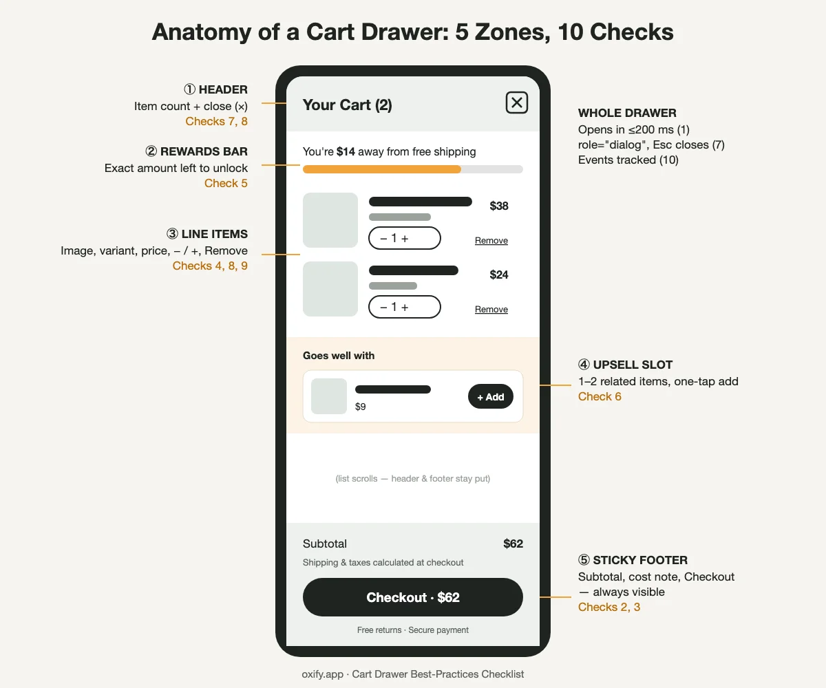
- ① Header: "Your Cart (2)" and a big close button. Tell shoppers where they are and how to leave. Checks 7, 8.
- ② Rewards bar: Free shipping, a free gift, or both. Keep it at the top so it's seen first. Check 5.
- ③ Line items: Image, name, variant, price, − / + and Remove. This is the only part that should scroll. Checks 4, 8, 9.
- ④ Upsell slot: One or two related add-ons with a one-tap "Add" button. It sits below the items, never above them. Check 6.
- ⑤ Sticky footer: Subtotal, a short cost note and the Checkout button. It never moves. Checks 2, 3.
Rule of thumb: the header and footer are fixed. Everything in between scrolls. If your upsells or banners sit in the fixed parts, they will eat the space that Checkout needs on small phones.
Mobile tip: On phones, make the drawer full width (or close to it). A narrow side panel on a 375 px screen leaves no room for product names or thumbs.
Now let's go through each one: what to do, why it matters, and how to test it.
1. Make It Open Fast
What: The drawer should slide in right away after a shopper taps "Add to cart."
Why: A slow drawer feels broken. Shoppers tap again and end up with two of the same item. Or they leave.
How to test:
- Open Chrome DevTools and set the network to "Fast 4G" and CPU to "4x slowdown."
- Tap Add to cart. Something should happen on screen within 200 ms. That's the "good" score for Interaction to Next Paint (INP).
- Load upsell products after the drawer opens, so they never block it.
- Show a loading state (like a spinner on the button) while the cart updates.
- Run Lighthouse before and after adding any cart app. Here's how to check if a cart app slows your store.
Common fail: Upsell products load first and hold the drawer back, or leftover code from an old cart app slows every tap.
2. Keep the Checkout Button Always Visible
What: Pin the checkout button to the bottom of the drawer. It should never scroll away.
Why: This is the bug from our opening story. It's the most common one we see. Upsells, notes and banners pile up, and the one button that makes money gets pushed down.
How to test:
- Add 10 different items to the cart.
- Check on a small phone (iPhone SE size, 375 px wide).
- Can you see and tap Checkout without scrolling? If yes, it passes.
Common fail: Banners and upsells push Checkout below the fold on phones.
3. Show the Real Cost — No Surprises
What: Show the subtotal, any discounts, and a short note about shipping and tax.
Why: Surprise costs are the top reason people abandon carts. You can't always show the exact shipping price in the drawer. But you can say "Free shipping over $50" or "Shipping calculated at checkout."
Quick wins:
- Show savings in a different color: "You saved $12."
- Show the discount code field only if you really use codes. An empty box makes people leave to go hunt for a coupon.
- Show accepted payment icons or express checkout buttons. Here's how express buttons fit in a drawer.
Common fail: No shipping or tax note in the drawer, so the real cost shows up as a surprise at checkout.
4. Make Items Easy to Edit
What: Each item needs a picture, name, variant (size or color), price, quantity buttons and a Remove link.
Why: If people can't fix a mistake fast, they bail. They won't hunt for a separate cart page.
Developer notes:
- On Shopify, use the Cart AJAX API (
/cart/change.js) so changes happen without a reload. - Stop double taps. Disable the +/− buttons while a request is running.
- If an update fails, keep the old cart on screen. Never wipe it.
- If stock is limited, say so: "Only 3 left."
Common fail: A failed update leaves a frozen spinner, or wipes the cart.
5. Show Free-Shipping Progress
What: A bar that says, "You're $14 away from free shipping."
Why: It turns a cost into a game. Shoppers love finishing a progress bar. It's also the fastest way to lift average order value (AOV).
Rules that work:
- Set the goal a little above your average order. If your AOV is $40, try $50.
- Our starting point at Oxify is about 1.3× your AOV for the first goal. With three goals, we start near 1.3×, 1.8× and 2.4×. The math is here.
- More than one goal works. Crossword, India's best-known bookstore chain, runs free shipping, then an extra 5% off, then an extra 10% off. They reported a 20% lift in additional revenue. See the case study.
- A free gift works the same way. One Oxify store with a £40 AOV set a gift at £55, and 35 shoppers stretched to reach it. That's about £525 in extra cart value. Breakdown here.
- Show a clear "You unlocked free shipping!" message when they hit it.
- If you sell in many countries, make sure the amount changes with the currency. See how geo-based rewards work.
Common fail: The bar says "Free shipping over $50" but never says how much is left.
6. Add Upsells — But Only One or Two
What: Show one or two products that go with what's already in the cart.
Why: The drawer is a great place to add value. But too many offers turn it into a billboard. Then shoppers feel pushed and leave.
Do this:
- Pick related items. Phone case with a phone. Socks with shoes.
- Keep upsells cheaper than the main item. A small add-on is an easy "yes."
- Attach a small saving. In our Frequently Bought Together widget data (Q1 2026), a 5–10% discount roughly doubled the take rate of an offer. That's a product-page widget, not a drawer, so treat it as a strong hint and test it in yours. Data here.
- Use a one-tap "Add" button. No new page, no pop-up.
- Hide an upsell once it's in the cart.
Don't do this:
- Don't show 6 random "best sellers." Too many choices and people pick none.
- Don't pre-tick paid add-ons like shipping protection. Let the shopper choose.
- Don't let upsells push Checkout off-screen (see point 2).
What our own merchant data shows:
- One Oxify merchant made $16,438 in cart drawer revenue in 30 days from in-cart upsells alone, with no product-page offers running. Full breakdown here.
- Replenhair, a UK hair brand, earned £15,451 in upsell revenue. The split: £8,742 from the cart drawer, £4,136 from the product page and £2,573 post-purchase. That's 57% of the total. The drawer beat the other two spots put together. See the case study.
The takeaway: the drawer is the best upsell spot in the store. That's why it pays to get it right, not to stuff it.
Want the full playbook? Read how to add upsells to your Shopify cart drawer and whether upsells hurt conversion rate.
Common fail: A carousel of 6 "best sellers," upsells that need a size picker first, or paid add-ons ticked by default.
7. Make It Accessible
What: Anyone should be able to use your drawer, including people using a keyboard or a screen reader.
Why: It's the right thing to do, and it's also a legal risk in many places. The EU's European Accessibility Act has applied to many online stores since June 2025.
Acceptance criteria (paste into your ticket):
- Follow the standard ARIA modal dialog pattern.
- Drawer uses
role="dialog"andaria-modal="true"with a label like "Your cart." - When it opens, keyboard focus moves inside the drawer.
- Tab key stays trapped inside while it's open.
- Esc closes it, and focus goes back to the button that opened it.
- Cart updates are announced with an
aria-liveregion ("Cart updated, 3 items"). - Text contrast meets WCAG 2.2 AA (4.5:1 for normal text).
- Icon-only buttons (×, +, −) have text labels like
aria-label="Remove item". - Still works when the page is zoomed to 200%.
Common fail: Focus stays on the page behind, so keyboard users can't reach the drawer, or can't leave it.
8. Build for Thumbs, Not Mice
What: Make every button big enough to tap with a thumb.
Why: Most shopping traffic is on phones, and phones are where drawers go wrong (see the A/B test above). Tiny "×" and "−" buttons cause mis-taps and frustration.
Specs:
- 44×44 pt minimum for tap targets. That's the common mobile design guideline. WCAG 2.2's hard floor is 24×24 px.
- On mobile, the drawer should be full width or close to it (at least 85%).
- The close button goes top-right. Tapping outside the drawer should also close it.
- Lock the page behind the drawer so it doesn't scroll too.
Common fail: Trash, ×, + and − icons under 24 px, and a page that scrolls behind the open drawer.
9. Plan for the Awkward Moments
What: Design the states nobody puts in the mockup.
Why: These are where carts quietly break. And they're almost never in the Figma file.
Check every one of these:
- Empty cart: Don't show a sad blank box. Show best sellers or a "Keep shopping" button. Empty cart design ideas here.
- Sold out: Say which item is out and offer a fix (remove it, or pick another size).
- Network error: Show "Something went wrong, try again," not a frozen spinner.
- Long product names: Cut them off neatly at two lines.
- Other languages: German words are long. Test that buttons don't break. Multi-language tips here.
- Two drawers: If you install a cart app, turn off the theme's own drawer so they don't fight.
Common fail: A blank "Your cart is empty" box, or the theme drawer and an app drawer both opening.
10. Track It So You Know It's Working
What: Send an event for each important action in the drawer.
Why: Without data, you're guessing. With it, you can A/B test one change at a time.
Events to track:
cart_drawer_opencart_item_quantity_changeandcart_item_removeupsell_viewandupsell_addfree_shipping_goal_reachedcheckout_clickfrom the drawer
The 3 numbers to watch: drawer-to-checkout rate, upsell take rate, and AOV. Split each one by phone vs desktop. A win on desktop can hide a loss on mobile. Here's how to measure cart upsell performance.
Why the device split matters: in our Frequently Bought Together widget data (Q1 2026), mobile take rate beat desktop in 60% of stores. The other 40% went the other way. A blended number hides which group you're in. See the analysis.
Common fail: Changes ship on gut feel, and a mobile drop hides inside a desktop win.
Real Stores, Scored: 4 Brands Tested on a Phone
We tested the checklist on real stores. We added a product to each cart on a 390 px phone screen (iPhone size) on September 19, 2026, and scored what we could see.
How we scored: Points 1 (speed) and 10 (tracking) can't be judged fairly from outside a store, so we scored the other 8. Stores change their carts often, so treat these as a snapshot.
How we tested (so you can repeat it):
- Setup: Chrome 153 on macOS, driven through Chrome DevTools. Device emulation set to 390×844 px, 2× pixel ratio, mobile and touch on. That's an iPhone 14-size screen. It's an emulated phone, not a real one.
- Cart: one in-stock product added, then the cart icon tapped to open the drawer. Rothy's was also tested empty.
- Tap-target size: we read the rendered box of each
<button>(width × height in CSS px, the same numbers DevTools shows when you Inspect an element). Anything under 24×24 px fails. You can repeat it: right-click the icon → Inspect → hover the<button>tag and read the size in the tooltip. - Keyboard test, in steps: (1) put focus on the cart icon, (2) open the drawer, (3) note which element has focus, (4) press a real Esc key, (5) check the drawer closed, (6) check where focus went. "Focus returns" means that after step 5, focus is back on the cart icon, so a keyboard user carries on from where they were.
- Not tested: no screen reader (VoiceOver was off), no real devices, no Safari, and only 1–2 items in the cart. So point 7 here means keyboard behaviour only, and point 2 wasn't stress-tested with 10+ items.
Allbirds: 5 of 8 pass, 1 partial
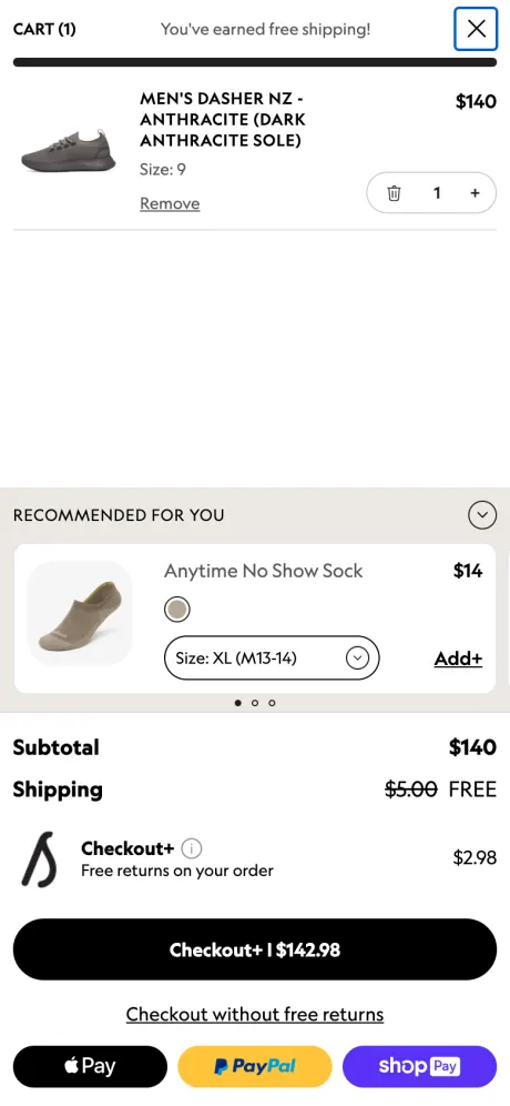
- ✅ Free-shipping bar (5): "You've earned free shipping!" with a full bar, and the $5.00 shipping fee shown crossed out.
- ✅ Cost clarity (3), editing (4), sticky footer (2): Subtotal and shipping are clear. Apple Pay, PayPal and Shop Pay sit right under Checkout.
- ⚠️ Keyboard (7): Focus jumps to the close button when the drawer opens, and Esc closes it. But focus then stays on the hidden close button instead of going back to the cart icon.
- ❌ Upsell (6): The sock is a great match, but you must pick a size before adding. That's not one-tap.
- ❌ Paid add-on (6): The main button reads "Checkout+ | $142.98". It adds $2.98 for free returns. To skip it, you tap a smaller "Checkout without free returns" link. That's an opt-out, not an opt-in.
- ❌ Tap targets (8): The trash button measured 16×16 px and the + button 7×16 px. The close button (32×32 px) passes.
Lesson: Great bones. Make the add-on a choice, not a default.
Olipop: 5 of 7 pass, 1 partial
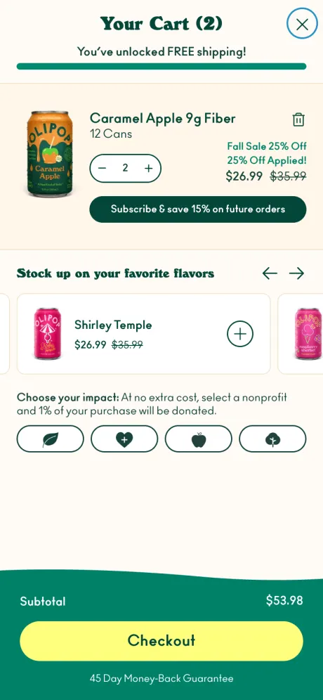
- ✅ Free-shipping bar (5): "You've unlocked FREE shipping!" right under the title.
- ✅ Savings shown (3): "Fall Sale 25% Off Applied!" with the old price crossed out.
- ✅ Upsells (6): Related flavors with a one-tap ⊕ button, plus "Subscribe & save 15%." Relevant and easy.
- ✅ Sticky footer (2): Big yellow Checkout button with "45 Day Money-Back Guarantee" under it.
- ⚠️ Keyboard (7): Focus moves in and Esc closes it, but focus doesn't return to the cart button afterwards.
- ❌ Tap targets (8): The trash icon measured 19×20 px, under the 24 px minimum.
Lesson: This is what "helpful, not pushy" upselling looks like.
Rothy's: 7 of 8 pass
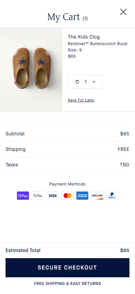
- ✅ Cost clarity (3): The best we saw. Subtotal, "Shipping: FREE", "Taxes: TBD" and an "Estimated Total." No surprises.
- ✅ Keyboard (7): Esc closes the drawer and focus goes back to the bag icon. That's the textbook way.
- ✅ Tap targets (8): The − / + box is large and easy to hit.
- ✅ Empty cart (9): Four big photo tiles to popular categories (see below).
- ➖ Free-shipping bar (5): Not needed. Shipping is free on everything, and the footer says so.
- ❌ Upsell (6): None at all. A cart full of shoes with no socks or care kit is a missed sale.
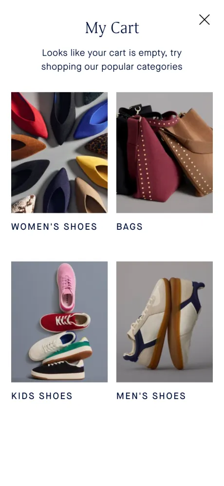
Lesson: Clear and calm. Add one small upsell and it's near perfect.
Brooklinen: no drawer on mobile (and why that's OK)
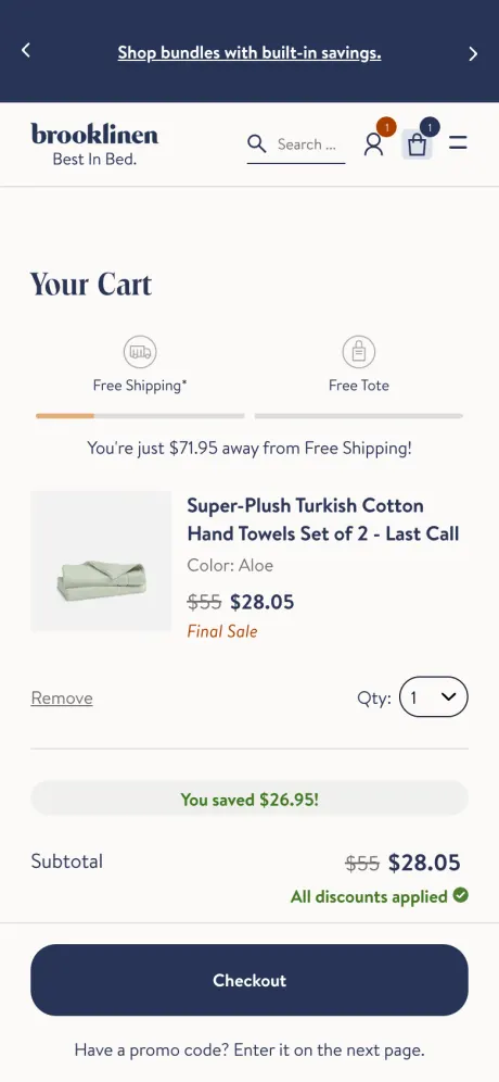
Brooklinen's cart icon opens a full cart page on phones, not a drawer. We didn't score it, but it's worth copying from:
- Two-step rewards bar: Free Shipping, then a Free Tote. "You're just $71.95 away from Free Shipping!"
- Savings in green: "You saved $26.95!" and "All discounts applied ✓."
- Smart promo code line: "Have a promo code? Enter it on the next page." No empty box tempting people to go hunt for coupons.
Lesson: A drawer isn't required. If your carts are big or complex, a cart page is fine. The same checklist still applies.
Scorecard
| Check | Allbirds | Olipop | Rothy's |
|---|---|---|---|
| 2. Checkout always visible | ✅ | ✅ | ✅ |
| 3. No cost surprises | ✅ | ✅ | ✅ |
| 4. Easy to edit | ✅ | ✅ | ✅ |
| 5. Free-shipping progress | ✅ | ✅ | ➖ (always free) |
| 6. Smart upsells | ❌ | ✅ | ❌ |
| 7. Keyboard access | ⚠️ | ⚠️ | ✅ |
| 8. Thumb-friendly | ❌ | ❌ | ✅ |
| 9. Edge cases (empty cart) | ✅ | — | ✅ |
| Score | 5/8 + 1 partial | 5/7 + 1 partial | 7/8 |
✅ pass · ❌ fail · ⚠️ partial · ➖ not needed (counted as a pass) · — not tested. We didn't empty Olipop's cart, so it's scored out of 7.
The pattern: Even big brands miss point 8. Small icon buttons (trash, ×, +) are the most common fail. Give them padding and you beat most of the market.
What We See in Oxify Support Tickets and Merchant Calls
We build cart software, so we look at broken drawers every week. These are the patterns that come up most:
- Two drawers at once. The theme drawer and an app drawer both run. This is the worst speed case we see in support tickets, and the most common conflict. (Point 9)
- Leftover code. Snippets from an uninstalled cart app still sit in
theme.liquid. It's the most common silent speed tax. (Point 1) - The cart app gets blamed, but it's rarely alone. Chat widgets, review galleries and pop-ups often load far more code than a slide cart does. How to check. (Point 1)
- Too many upsells. In our merchant data, 2 to 3 offers is the ceiling. Past that, shoppers scroll by all of them. (Point 6)
- Too many trust badges. Payment logos and one guarantee are enough. More than that starts to look like a site trying too hard. (Point 3)
On review calls, we score a drawer 1 or 0 on six quick rows: cost, path to free shipping, pay, trust, speed and offer. This 10-point checklist is the longer version of that same scorecard. See the 6-row version and the 9 fixes that go with it.
How to Use This Checklist With Your Team
This is where the checklist earns its keep. Use it in three places:
- Design handoff: Add the 10-row table to your Figma file. Ask the designer to mock up the edge cases from point 9.
- Developer ticket: Paste the "Pass if…" column as acceptance criteria. The ticket isn't done until all 10 pass.
- QA and sprint review: Test on one real iPhone and one real Android phone. Not just a desktop browser window made smaller.
Copy-paste version for tickets:
CART DRAWER - ACCEPTANCE CRITERIA
[ ] 1. Add-to-cart tap shows a response within 200 ms (4x CPU slowdown, Fast 4G)
[ ] 2. Checkout button is sticky and visible with 10+ items at 375 px width
[ ] 3. Subtotal, discounts and a shipping/tax note show before checkout
[ ] 4. Quantity +/- and Remove work with no page reload; failed update keeps cart
[ ] 5. Free-shipping bar shows exact amount left and updates instantly
[ ] 6. Max 1-2 related upsells, one-tap add, never push Checkout off-screen
[ ] 7. role="dialog", focus moves in, Tab trapped, Esc closes, aria-live updates
[ ] 8. All tap targets at least 44x44; page behind drawer does not scroll
[ ] 9. Empty cart, sold-out item, network error and long titles all handled
[ ] 10. Events fire: drawer open, qty change, remove, upsell add, checkout click
Tested on: [ ] real iPhone  [ ] real Android  [ ] keyboard only  [ ] duplicate theme
Tip: Always test on a duplicate theme first, never the live one. And don't fix all 10 at once. Start with points 2, 3 and 5. They usually bring the biggest win for the least work.
Build It Yourself or Use an App?
You can build all of this with custom code. But it takes time, and every theme update can break it.
That's why we built Oxify Cart Drawer & Upsell. Here's how it maps to the checklist:
- Points 2–6: Sticky checkout, discount display, quick edits, a free-shipping bar and in-cart upsells all come built in.
- Point 1: It carries Shopify's Built for Shopify badge, which means Shopify has checked it for speed and quality.
- Extras: Free gifts, quantity breaks and country-based rewards, all inside the drawer.
As of September 19, 2026, it's rated 4.9 stars from 40 reviews on the Shopify App Store. Plans start at $9.99/month with a 14-day free trial. You can set it up in about 10 minutes without code. Want to compare options first? See our best Shopify cart drawer apps roundup.
FAQ
What are the most important cart drawer best practices?
How many upsells should a cart drawer show?
What should I include in a cart drawer QA test?
How big should buttons be in a mobile cart drawer?
How fast should a cart drawer open?
Do cart drawers hurt mobile conversions?
Is a cart drawer better than a cart page?
How do I make a cart drawer accessible?
Can I use this checklist as Jira acceptance criteria?
Your Next Step
Grab your phone right now. Add something to your own cart. Run through the 10-point table above.
Most stores fail at least two checks. Fix those first. Then, if you'd rather not code it all by hand, install Oxify Cart Drawer & Upsell and tick off most of the list in one afternoon.